What is the Sticky Cards in elementor?
The Sticky Cards is a unique layout tool that displays a group of individual content cards in a single column. The defining feature is that as the user scrolls, each card will become “sticky” and hold its position at a fixed point in the viewport before being replaced by the next card in the group. This creates a powerful, scroll-driven narrative effect, ensuring that each piece of content receives focused attention sequentially.
Using the Sticky Cards widget in Elementor, you can create smooth sticky scrolling Elementor layouts such as feature highlights, timelines, or step-by-step sections—without custom code.
Common use case
A common use case for the Sticky Cards is creating a Scroll-Driven Narrative for a company’s timeline or a product’s evolution. You can dedicate one Sticky Card to a specific year or milestone (e.g., “2018: Founding,” “2020: Series A Funding,” “2023: Global Launch”). As the user scrolls, the cards snap into place sequentially, guiding them through a story without ever losing focus on the current section. This makes complex information digestible and highly engaging.
How Sticky Scrolling Works in Elementor
Sticky scrolling means an element stays fixed within its parent container while the rest of the page scrolls.
In Elementor, sticky behavior can be applied to:
- Elementor sticky section
- Sticky container Elementor
- Elementor sticky sidebar
- Elementor sticky header
Sticky Cards extend this functionality by stacking multiple sticky elements with scroll-based transitions.
Additional use cases
- Step-by-Step Tutorial: Break down a complex process into sequential steps, where each step’s content “sticks” as the user scrolls past the full instructions for that step.
- Feature Showcase: Highlight a product’s main features, dedicating one card to the title and image of the feature while the corresponding text and details scroll next to it.
- Case Study Segmentation: Divide a long case study into distinct phases (e.g., “Problem,” “Solution,” “Results”) using the sticky effect to emphasize the transition between sections.
Requirements
To use the Sticky Cards, you need to have the following:
- You need the Marquee Addons and Marquee Addons Pro plugin installed and activated on your website.
- You can find detailed installation instructions in our installation guide.
- Make sure that this addon is enabled so you can find it in the Elementor editor.
- Marquee Addons works only with the Elementor Page Builder plugin, so you will need to have it installed and activated as well. The Elementor Page Builder runs on WordPress.
Add the widget
To add the Sticky Cards to your Elementor-powered website, follow these simple steps:
- Navigate to the Elementor editor for the page you want to edit.
- In the widgets panel, search for the Sticky Cards.
- Drag the widget to your desired location on the page.

Video tutorial for Sticky Cards
See a video demonstrating the widget in action.
Settings for the Sticky Cards
The Sticky Cards offers customization options categorized into three main tabs: Content, Style, and Advanced.
Content tab
The Content tab is where you define the cards and their structure.
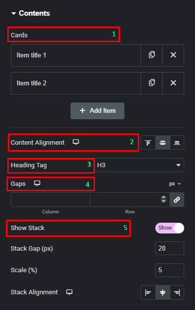
- Contents
- Cards: Use this repeater field to add, duplicate, or delete individual cards (e.g., “Item title 1,” “Item title 2”).
- Content Alignment: Set the alignment for the content inside the cards (Left, Center, Right).
- Heading Tag: Select the HTML tag for the content heading (e.g., H3).
- Gaps (Column/Row): Adjust the spacing between the cards in both column and row directions.
- Show Stack: Toggle this control to show or hide the card stack display.
- Show Stack: Toggle this button to enable the stacking effect for cards not currently sticky.
- Stack Gap (px): Control the vertical distance between the cards in the stacked group.
- Scale (%): Set the percentage by which the stacked cards are scaled down, creating a subtle depth effect.
- Stack Alignment: Define the horizontal alignment of the stacked cards (Left, Center, Right).
- Card Items
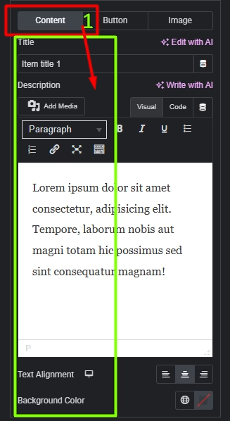
- Content:
- Title: Enter the heading text for the card. This is typically the primary label or highlight for the sticky item.
- Description: Add the main content for the card using the editor. You can include formatted text, links, or media to explain details or provide context.
- Text Alignment: Set the alignment of the text content inside the card (Left, Center, or Right).
- Background Color: Choose a background color for the card content area to visually separate it from other cards or the page background.
- Content:
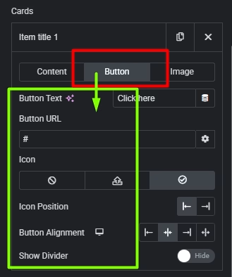
- Button
- Button Text: Enter the label for the button (for example, “Click here” or any custom CTA).
- Button URL: Add the link the button should navigate to when clicked.
- Icon: Choose an optional icon to display inside the button, or disable it if not needed.
- Icon Position: Set whether the icon appears before or after the button text.
- Button Alignment: Align the button inside the card (Left, Center, or Right).
- Show Divider: Toggle to show or hide a divider line that visually separates the button from the card content.
- Image
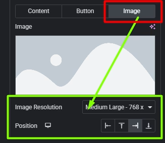
- Image: Upload or select the image to display for the card.
- Image Resolution: Choose the image size to load (for example, Medium Large – 768px) to balance quality and performance.
- Position: Set the position of the image within the card (Top, Bottom, Left, or Right).
Style tab
The Style tab provides options to fine-tune the appearance of the card container, the title, and the description.
- Card
- Gap On Top: Adjust the vertical spacing at the top of the card.
- Width: Control the width of the card, set in percentages.
- Background Type: Choose the background type for the card (e.g., solid color or gradient).
- Padding: Set the inner spacing for the card.
- Border Type: Add a border to the card.
- Border Radius: Adjust the corner radius of the card.
- Box Shadow: Add a shadow effect to the card.

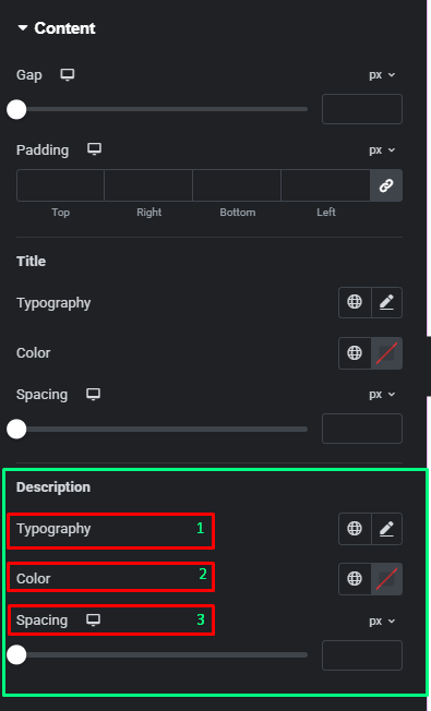
- Content
- Gap: Adjust the spacing between elements within the card content.
- Padding: Set the inner spacing for the content area.

- Title
- Typography: Customize the font settings for the card title.
- Color: Set the color of the card title text.
- Spacing: Adjust the space below the title.

- Description
- Typography: Customize the font settings for the card description.
- Color: Set the color of the card description text.
- Spacing: Adjust the space below the description.
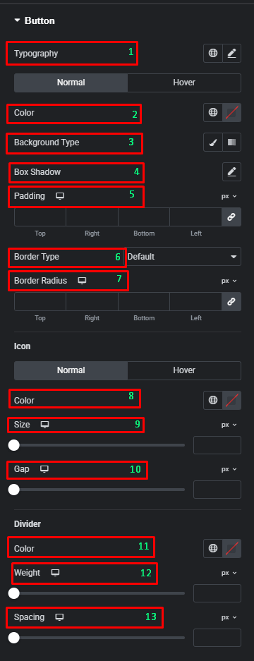
- Button
- Typography: Customize the font style, size, and weight for the button text.
- Normal / Hover (Color): Set the text color for the button in its default state and when the user hovers over it.
- Normal / Hover (Background Type): Choose the background type (solid color, gradient, or image) for the button in its default state and on hover.
- Box Shadow: Add a shadow effect to the button container.
- Padding: Adjust the inner spacing around the button’s content.
- Border Type: Add a border to the button (e.g., solid, dashed, dotted).
- Border Radius: Set the curvature of the button’s corners.
- Icon (Normal / Hover): Toggle between styling the icon in its default state and on hover.
- Icon Color: Set the color of the button’s icon.
- Icon Size: Adjust the size of the icon.
- Icon Gap: Control the spacing between the icon and the button text.
- Divider (Color): Set the color for an optional divider line.
- Divider Weight: Adjust the thickness of the divider line.
- Divider Spacing: Control the vertical space above and below the divider.
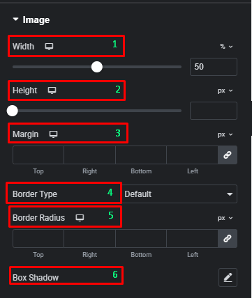
- Image
- Width: Control the width of the image inside the card, set in percentages.
- Height: Control the height of the image.
- Margin: Set the outer spacing around the image.
- Border Type: Add a border to the image.
- Border Radius: Adjust the corner radius of the image.
- Box Shadow: Add a shadow effect to the image.
Advanced tab
The Advanced tab provides a comprehensive set of controls that are common to most Elementor widgets, allowing for refined design and responsiveness. Here you can adjust the widget’s Layout (e.g., positioning, Z-index), apply engaging Motion Effects (like scrolling effects or entrance animations), customize its Background, add Borders and Box Shadows, apply Masks for unique shapes, control Responsive visibility across devices, add custom HTML Attributes, and inject Custom CSS for bespoke styling.
Frequently Asked Questions (FAQ)
Can I change the sticking behavior of the cards?
The specific sticking behavior (top/bottom offset, duration) is typically controlled in the Advanced tab under Motion Effects or a dedicated Sticky section, which is common to Elementor’s framework
Where can I control the spacing between individual Sticky Cards?
In the Content tab, under the Contents section, you can use the Gaps control to adjust the spacing between the cards in both the column and row directions.
How do I change the size and alignment of the image within a card?
You can change the image dimensions using the Width and Height controls in the Style tab under the Image section.


