What is the Smart Tabs in Elementor?
Smart Tabs widget allows you to organize content into multiple, distinct sections within a single container, accessible by clicking on corresponding titles (tabs). This is a powerful way to present a large amount of information concisely, saving vertical space and improving user experience by allowing visitors to easily navigate to the specific content they are interested in.
- A tab slider in Elementor layout
- Responsive tabs for Elementor that adapt on all devices
- Dynamic post tabs Elementor sections inside your templates
- Advanced elementor tab control settings
Improve your Elementor designs with responsive tabs for Elementor using the powerful Smart Tabs widget from Marquee Addons. Whether you want a tab slider in Elementor, post tabs Elementor or advanced elementor tab control.
Common use case
A common use case for the Smart Tabs widget is to display Product/Service Features on a dedicated page. By utilizing tabs, you can clearly present core features of a product or service, dedicating a separate, detailed tab to each major function or benefit. This prevents overwhelming the user with text and provides an organized, interactive way to explore everything the offering provides.
Additional use cases
- FAQ (Frequently Asked Questions) Section: Use the widget to group related questions into different categories (e.g., “General,” “Technical,” “Billing”). This helps keep the page clean and allows users to quickly find answers by selecting the relevant category tab.
- Pricing Plans: Showcase different subscription or pricing tiers with specific details in each tab.
- Step-by-Step Instructions: Break down a complex process into sequential steps, using a tab for each step.
Requirements
To use the Smart Tabs widget, you need to have the following:
- You need the Marquee Addons and Marquee Addons Pro plugin installed and activated on your website.
- You can find detailed installation instructions in our Smart Tabs guide.
- Make sure that this addon is enabled so you can find it in the Elementor editor.
- Marquee Addons works only with the Elementor Page Builder plugin, so you will need to have it installed and activated as well. The Elementor Page Builder runs on WordPress.
Add the widget
To add the Smart Tabs widget to your Elementor-powered website, follow these simple steps:
- Navigate to the Elementor editor for the page you want to edit.
- In the widgets panel, search for the Smart Tabs widget.
- Drag the widget to your desired location on the page.

Video tutorial for Smart Tabs
See a video demonstrating the widget in action.
Settings for the Smart Tabs widget
The Smart Tabs widget offers extensive customization options categorized into three main tabs: Content, Style, and Advanced.
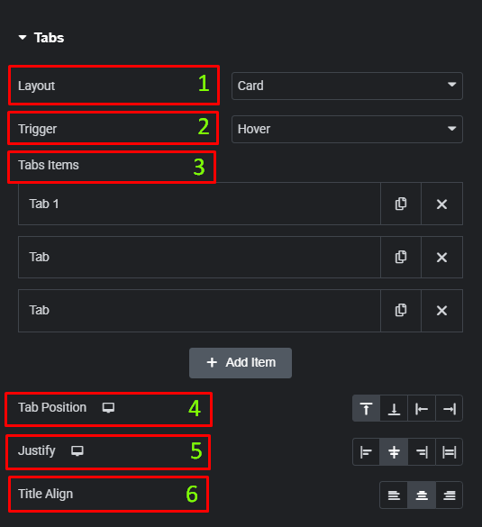
Content tab
The Content tab is where you structure the tabs and their respective content.
- Tabs
- Layout: Choose the layout for your tabs (e.g., Card).
- Trigger: Choose the trigger action for tab switching (e.g., Hover or Click).
- Tabs Items: Use this repeater field to add, duplicate, or delete individual tabs. Each item contains the content for one tab.
- Tab Position: Set the position of the tab titles (e.g., Top, Bottom, Left, Right).
- Justify: Align the tab titles (e.g., Left, Center, Right, Full Width).
- Title Align: Set the text alignment for the tab titles.
- Content Tab
- Heading Tag: Select the HTML tag for the content heading (e.g., H3).
- Image Position: Set the position of the image within the tab content (e.g., Left, Right, Top, Bottom).
- Alignment: Set the horizontal alignment for the content.
- Vertical Alignment: Set the vertical alignment for the content.

Style tab
The Style tab provides options to fine-tune the appearance of the main container, the tab titles, the icons, and the content box.
- Container
- Gap Between Tabs: Adjust the spacing between individual tab titles.
- Distance from content: Control the vertical spacing between the tab titles and the main content area.

- Title
- Typography: Customize the font, size, and other typography settings for the tab titles.
- Text Shadow: Add a shadow effect to the tab titles.
- Text Stroke: Add a stroke effect to the tab titles.
- Background Color: Set the background color for the tab titles for Normal, Hover, and Active states.
- Text Color: Set the color of the tab title text for Normal, Hover, and Active states.
- Border Type: Add a border to the tab titles.
- Border Radius: Adjust the corner radius of the tab titles.
- Padding: Set the padding inside the tab titles.

- Icon
- Icon Size: Adjust the size of the icon within the tab title.
- Icon Spacing: Control the space between the icon and the tab title text.
- Icon Position: Set the position of the icon relative to the title text.
- Color: Set the color of the icon for Normal, Hover, and Active states.

- Content Box
- Padding: Set the inner spacing for the content box.
- Margin: Set the outer spacing for the content box.
- Background Color: Set the background color for the content box.
- Border Type: Add a border to the content box.
- Border Radius: Adjust the corner radius of the content box.
- Box Shadow: Add a shadow effect to the content box.

- Content
- Padding: Set the inner spacing for the main content area.
- Margin: Set the outer spacing for the main content area.
- Background Color: Set the background color for the main content area.
- Border Type: Add a border to the main content area.
- Border Radius: Adjust the corner radius of the main content area.

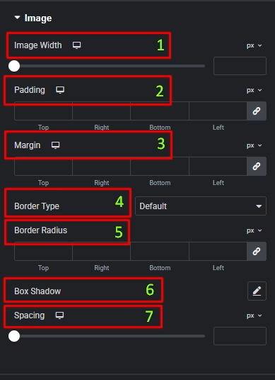
- Image
- Image Width: Control the width of the image within the tab content.
- Padding: Set the inner spacing around the image.
- Margin: Set the outer spacing around the image.
- Border Type: Add a border to the image.
- Border Radius: Adjust the corner radius of the image.
- Box Shadow: Add a shadow effect to the image.
- Spacing: Adjust the spacing after the image.
- Heading
- Color: Set the color of the heading text.
- Typography: Customize the typography for the heading.
- Text Shadow: Add a shadow effect to the heading text.
- Spacing: Adjust the spacing after the heading.

- Description
- Color: Set the color of the description text.
- Typography: Customize the typography for the description.
- Text Shadow: Add a shadow effect to the description text.
- Spacing: Adjust the spacing after the description.

- Button
- Text Color: Set the color of the button text for Normal and Hover states.
- Background Color: Set the background color of the button for Normal and Hover states.
- Typography: Customize the font settings for the button text.
- Border Type: Add a border to the button.
- Border Radius: Adjust the corner radius of the button.
- Padding: Set the inner spacing around the button content.

Advanced Smart tab
The Advanced tab provides a comprehensive set of controls that are common to most Elementor widgets, allowing for refined design and responsiveness. Here you can adjust the widget’s Layout (e.g., positioning, Z-index), apply engaging Motion Effects (like scrolling effects or entrance animations), customize its Background, add Borders and Box Shadows, apply Masks for unique shapes, control Responsive visibility across devices, add custom HTML Attributes, and inject Custom CSS for bespoke styling.
Frequently Asked Questions (FAQ)
Can I change the alignment of the tabs themselves?
Yes. In the Content tab, under the Tabs section, you can use the Justify control to align the tab titles (e.g., Left, Center, Right, Full Width).
Where can I control the spacing between the tabs and the content below them?
You can find the Distance from content control in the Style tab, under the Container section.
How do I change the color of a tab title when it is active?
In the Style tab, under the Title section, you can switch to the Active state and then set the desired Text Color and Background Color.


