What is the Image Hotspot widget?
The Image Hotspot widget allows you to create interactive, engaging images by placing clickable or hoverable points (hotspots) over a base image. When a user interacts with these points, a tooltip appears to reveal additional information, links, or media. It is a powerful tool for transforming static visuals into immersive experiences.
Common use case
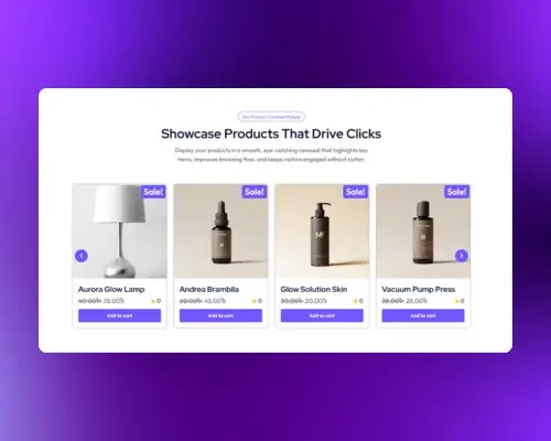
The most common use case for the Image Hotspot widget is interactive product showcases for e-commerce sites. For example, a furniture brand can use a single high-quality photo of a fully furnished room and place hotspots on the sofa, lamp, and rug. When a customer clicks a hotspot, they see the product name, price, and a direct link to purchase the item.
Additional use cases
- Interactive Maps: Highlight specific locations or landmarks on a custom map with detailed descriptions for each point.
- Anatomy of a Product: Break down complex machinery or software features by pointing out specific components and explaining their functions.
- Team Photos: Place hotspots over team members in a group photo to show their names, titles, and social media links.
Requirements
- You need the Marquee Addons plugin installed and activated on your website.
- You can find detailed installation instructions in our dedicated installation blog post.
- Make sure that this addon is enabled so you can find it in the Elementor editor.
- Marquee Addons works only with Elementor Page Builder plugin so you will need to have it installed and activated as well..
Add the widget
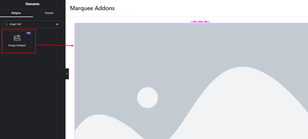
- Search for the Image Hotspot widget in the Elementor panel and drag it into your layout.
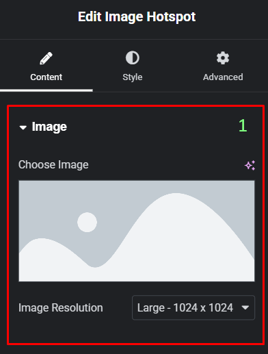
- In the Content tab, under the Image section, click Choose Image to upload or select your base visual.
- Expand the Hotspot section to begin adding individual points.
- Adjust the position of each hotspot by switching to the Position tab within the hotspot item settings.
Settings for the Image Hotspot widget
Content Tab
The Content tab defines the structure, information, and triggers for your interactive points.
- Choose Image: Select the background image that will host the hotspots.
- Image Resolution: Choose the appropriate resolution (e.g., Thumbnail, Medium, Large, Full) for your background image.
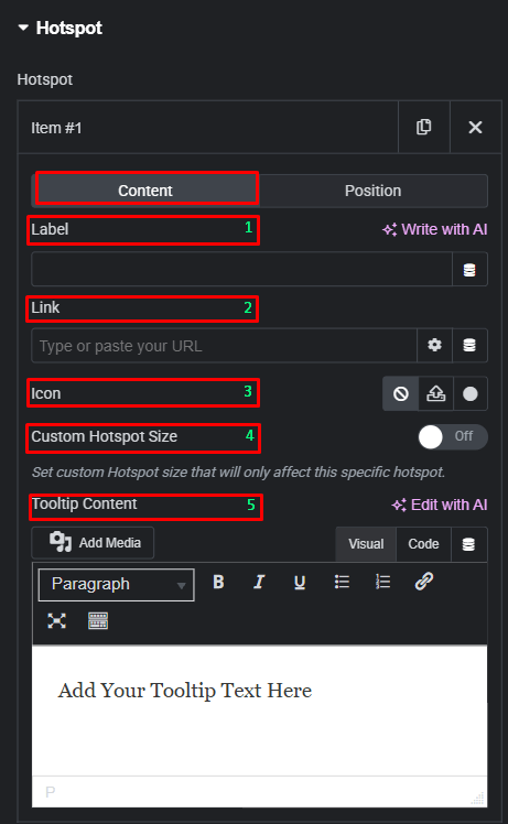
Hotspot
You can manage individual hotspots in this repeater list. Each item has two internal sub-tabs:
- Content (Item Level)
- Label: Add text that appears directly on or next to the hotspot marker.
- Link: Enter a URL to make the hotspot a clickable link.
- Icon: Choose an icon to represent the hotspot point.
- Custom Hotspot Size: A toggle to define a unique size for this specific hotspot rather than using the global style.
- Tooltip Content: A full text editor where you can add text, links, or media that appear inside the tooltip.
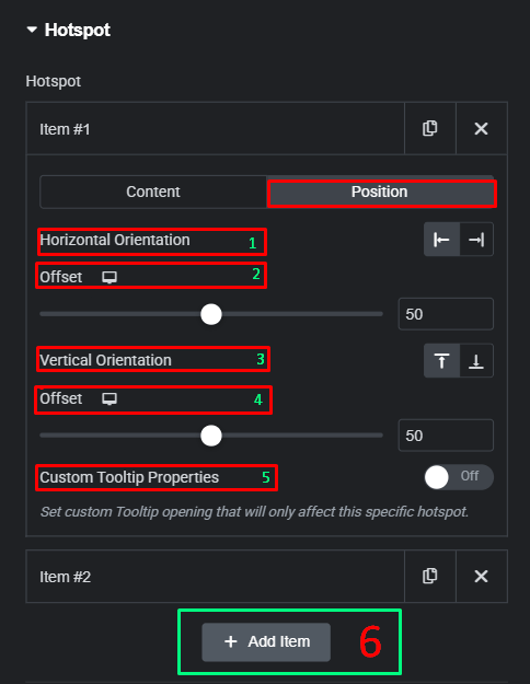
- Position (Item Level)
- Horizontal Orientation: Align the hotspot starting from the left or right side of the image.
- Horizontal Offset: Use the slider or numerical input to precisely place the hotspot horizontally.
- Vertical Orientation: Align the hotspot starting from the top or bottom of the image.
- Vertical Offset: Use the slider or numerical input to precisely place the hotspot vertically.
- Custom Tooltip Properties: A toggle that allows you to override global tooltip settings for just this specific hotspot.
- Add Item: Add new hotspot item
Global Hotspot Settings
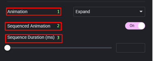
- Animation: Choose an entrance or attention-grabbing animation for the hotspots, such as Soft Beat, Expand, or Overlay.
- Sequenced Animation: Turn this On to have hotspots appear one after another rather than all at once.
- Sequence Duration (ms): Set the speed of the sequential entrance.
Tooltip
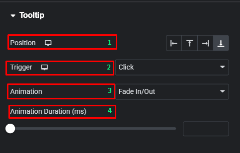
- Position: Choose where the tooltip appears relative to the hotspot (Top, Bottom, Left, Right).
- Trigger: Decide if the tooltip appears on Hover, Click, or not at all (None).
- Animation: Select the transition effect for the tooltip opening, such as Fade In/Out, Fade Grow, Fade By Direction, or Slide By Direction.
- Animation Duration (ms): Controls the speed of the tooltip opening animation.
Style Tab
The Style tab provides granular control over the visual aesthetics of the base image, the markers, and the pop-up tooltips.
Image
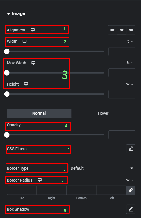
- Alignment: Set the horizontal alignment of the base image within its container.
- Width / Max Width: Control the scale of the image relative to its container.
- Height: Manually set a fixed height for the image.
- Opacity: Adjust the transparency of the image for Normal and Hover states.
- CSS Filters: Apply visual effects like Blur, Brightness, or Grayscale to the base image.
- Border Type: Choose from Solid, Doubled, Dashed, etc..
- Border Radius: Round the corners of the base image.
- Box Shadow: Add a shadow effect behind the base image.
Hotspot
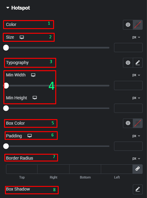
- Color: Set the color of the hotspot icon or label.
- Size: Adjust the overall size of the hotspot marker.
- Typography: Customize the font of the hotspot label.
- Min Width / Min Height: Set minimum dimensions for the hotspot marker box.
- Box Color: Change the background color of the hotspot marker.
- Padding: Add space inside the hotspot marker around the icon/label.
- Border Radius: Round the corners of the hotspot marker box.
- Box Shadow: Add a shadow effect to the hotspot marker to make it pop from the image.
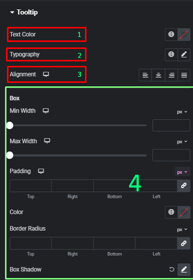
Tooltip
- Text Color: Set the color of the text inside the tooltip.
- Typography: Customize the font style for the tooltip content.
- Alignment: Align the text within the tooltip box (Left, Center, Right, Justified).
- Box Settings:
- Min Width / Max Width: Define the boundaries of the tooltip pop-up.
- Padding: Set the internal spacing of the tooltip box.
- Color: Set the background color of the tooltip.
- Border Radius: Round the corners of the tooltip box.
- Box Shadow: Add a shadow to the tooltip for a 3D effect.
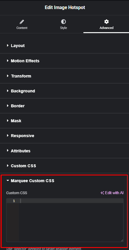
Advanced Tab
The Advanced tab provides a comprehensive set of controls that are common to most Elementor widgets, allowing for refined design and responsiveness. Here you can adjust the widget’s Layout (e.g., positioning, Z-index), apply engaging Motion Effects (like scrolling effects or entrance animations), customize its Background, add Borders and Box Shadows, apply Masks for unique shapes, control Responsive visibility across devices, add custom HTML Attributes, and inject Custom CSS for furfure styling.
Frequently Asked Questions (FAQ)
Are hotspots mobile-responsive?
Yes. You can adjust the Offset and Size of hotspots specifically for Tablet and Mobile views using the viewport icons next to those settings.
Can I use images or videos inside the tooltip?
Yes. The Tooltip Content area supports the “Add Media” button, allowing you to include images or rich text within the pop-up.
Can I make the hotspots pulse to grab attention?
Yes, by selecting the Soft Beat or Expand animation in the Hotspot settings, the markers will continuously animate to draw the user’s eye.
