What is the Image Accordion?
The Image Accordion is a dynamic tool for showcasing images with interactive content. It presents a series of images side-by-side, which expand to reveal a title and a description when a user hovers or clicks on them. This creates a visually engaging and space-saving way to display a gallery of products, portfolio items, or services, adding an element of surprise and interactivity to your website.
Common use case
A common use case for the Image Accordion is to display a product line on an e-commerce website. Each image in the accordion can represent a different product, and when a user interacts with it, they can see the product’s title and a brief description. This allows the business to showcase multiple products in a single section without cluttering the page.
Additional use cases
- Team member profiles: Show team photos that expand to reveal their name and title.
- Service highlights: Present different services offered, with a description of each.
- Portfolio projects: Display a visual portfolio where each image expands to show a project’s title and a short summary.
- Step-by-step processes: Illustrate a process or a series of stages with an image for each step.
Requirements
- You need the Marquee Addons plugin (Free) installed and activated on your website.
- You can find detailed installation instructions in our dedicated installation blog post.
- Make sure that this addon is enabled so you can find it in the Elementor editor.
- Marquee Addons works only with the Elementor Page Builder plugin, so you will need to have it installed and activated as well.
Drag and drop image accordion
- On the left side of the screen, you’ll see the Elementor widget panel.
- Scroll through the panel Marquee Addons and select Image Accordion.
- Click and hold on the widget you want to use, then drag it from the panel.

Image Accordion Contents
We’ll guide you on how to add or customize an image accordion, including the image, title, active behavior, and both horizontal and vertical alignment.
Images:
- Images: Use this repeater field to add and manage the individual accordion items. Click “Add Item” to include more.
- Choose Image: Upload an image for the accordion item.
- Title: Enter a title for the accordion item.
- Description: Add supporting text that appears when the accordion item expands.
- Button: Toggle On/Off to display a button inside the expanded item.
- Button Text: Enter the text for the button (shown when Button is enabled).
- Button URL: Add the link the button should point to.
- Active Behavior: Choose how the accordion expands, either on Click or Hover.
- Title Alignment:
- Horizontal: Set the horizontal alignment of the title.
- Vertical: Set the vertical alignment of the title.
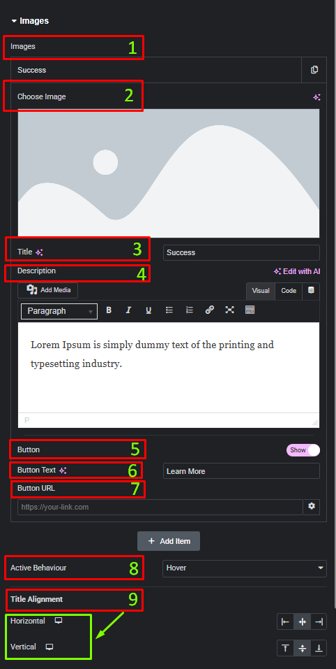
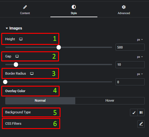
Image Accordion Styles
We’ll show you how to adjust image height, set spacing between images, customize overlay colors for normal and hover states, and configure title typography, color, position, and padding.
Images:
- Height: Set the height of the accordion using the slider or input field.
- Gap: Adjust the spacing between each image.
- Border Radius: Control the roundness of the entire accordion container.
- Overlay Color: Set the color of the image overlay for both normal and hover states.
- Background Type: Choose Classic or Gradient for the overlay background.
- CSS Filters: Apply visual effects such as Blur, Brightness, Contrast, Saturation, and Hue to the images.
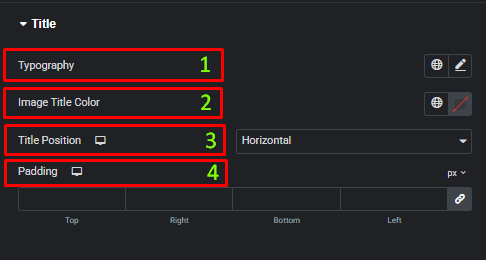
Title:
- Typography: Customize the font family, size, weight, and style for the image title.
- Image Title Color: Set the color of the title text.
- Title Position: Choose how the title is positioned on the image (e.g., Horizontal).
- Padding: Adjust the inner spacing around the title for better placement and readability.
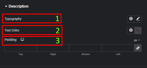
Description:
- Typography: Customize the font family, size, weight, and style for the description text.
- Text Color: Set the color of the description text.
- Padding: Adjust the inner spacing around the description for better readability and layout control.
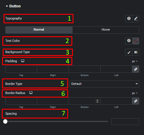
Button:
- Typography: Customize the font family, size, weight, and style of the button text.
- Text Color: Set the button text color for Normal and Hover states.
- Background Type: Choose Classic or Gradient for the button background, with separate options for Normal and Hover states.
- Padding: Adjust the inner spacing of the button for better balance and clickability.
- Border Type: Select the border style for the button (Default, None, Solid, Dashed, Dotted, etc.).
- Border Radius: Control the roundness of the button corners.
- Spacing: Set the space between the button and surrounding content.
Frequently Asked Questions (FAQ)
Can I control the image size in the Image Accordion widget?
Yes, adjust the Height of the images in the Style tab to control their size.
Can I change the order of the items in the Image Accordion?
Yes, you can reorder items by dragging and dropping them within the Repeater field in the Content tab.
Is it possible to add captions or descriptions that appear with the image?
Yes, add Title and Description fields for each image in the Content tab, which will appear when the image expands.


