What is the Image Accordion Pro widget?
Image Accordion Pro widget is an engaging layout addon that displays a series of images and content in a visually compact, accordion-style container, featuring an interactive expansion effect: when a user hovers over or clicks a panel, it expands to its full size while the other panels collapse, providing a space-saving and interactive way to showcase visual content along with associated details.
Common Use Case
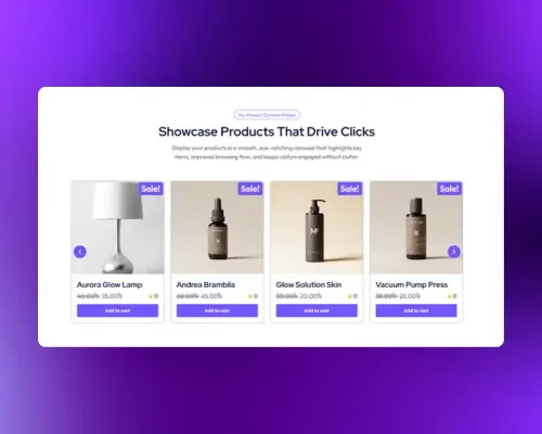
A common use case for the Image Accordion Pro widget is creating an Interactive Portfolio Showcase.
You can dedicate each accordion panel to a specific project or client. The accordion uses the image as the main visual element, and the text overlay (project title/category) becomes the focus upon expansion. This allows you to showcase a diverse range of work in a small space, keeping the overall design sleek and modern.
Additional Use Cases
- Team Member Display: Showcase team members’ portraits, where the panel expands to reveal their bio and title upon interaction.
- Product Feature Breakdown: Break down a product into its core features, dedicating one expanding panel to each feature and using the image to showcase that specific aspect.
- Location/Service Menu: Display different geographical locations or service packages in a compact layout, expanding to show details, a specific contact button, or a map.
Requirements and Installation
To use the Image Accordion Pro widget, you must meet the following requirements:
- Plugin Requirement: You need the Marquee Addons and Marquee Addons Pro plugin installed and activated on your website.
- Platform Requirement: Marquee Addons works only with the Elementor Page Builder plugin, so you will need to have it installed and activated as well. The Elementor Page Builder runs on WordPress.
- Activation: Ensure that this specific Image Accordion Pro addon is enabled so you can find it in the Elementor editor.
Add the widget
To add the Smart Tabs widget to your Elementor-powered website, follow these simple steps:
- Navigate to the Elementor editor for the page you want to edit.
- In the widgets panel, search for the Image Accordion Pro widget.
- Drag the widget to your desired location on the page.

Video tutorial for Image Accordion Pro
See a video demonstrating the widget in action.
Settings for the Image Accordion Pro
The customization options for the Image Accordion Pro widget are divided into three main tabs: Content, Style, and Advanced.
Content Tab
The Content tab is where you define the individual accordion items, their images, content, buttons, and structural settings.
Cards (Repeater Field): Use this to add, duplicate, or delete individual cards (e.g., “Item title 1,” “Item title 2”).
- Image Sub-Tab:
- Image: Select or upload the image for the accordion item.
- Image Resolution: Choose the size/resolution of the displayed image (e.g., Medium Large – 768 x 0).
- Content Sub-Tab:
- Title: Input the title text for the item.
- Description: Input the main body text/description for the item.
- Button Sub-Tab:
- Button Text: Input the text for the button (e.g., “Click here”).
- Button URL: Input the URL the button should link to.
- Icon: Select or upload an icon to display on the button.

Controls (General Settings):
- Content Alignment: Set the vertical alignment for the content inside the cards.
- Text Alignment: Set the horizontal alignment for the text inside the cards.
- Heading Tag: Select the HTML tag for the content heading (e.g., H3).
- Gaps (Column/Row): Adjust the spacing between the cards in both column and row directions.

Style Tab
The Style tab provides options to fine-tune the appearance of the card container, the title, and the description.
Card:
- Width: Control the static width of the card.
- Height: Control the height of the card.
- Open Card Width: Set the specific width of the card when it is expanded/open.
- CSS Filters: Apply visual filters to the card.
- Overlay Color: Set a color that overlays the image.
- Border Type / Border Radius: Add a border and round the corners of the card.
- Box Shadow: Add a shadow effect to the card.

Content:
- Padding: Set the inner spacing for the content area.
- Title:
- Typography: Customize the font settings.
- Color: Set the color of the title text.
- Spacing: Adjust the space below the title.
- Description:
- Typography: Customize the font settings.
- Color: Set the color of the description text.
- Spacing: Adjust the space below the description.

Button:
- Typography: Customize the font settings for the button text.
- Color: Set the text color for Normal and Hover states.
- Background Type: Choose the background type (e.g., solid color or gradient).
- Box Shadow: Add a shadow effect to the button.
- Padding: Set the inner spacing around the button content.
- Border Type / Border Radius: Add a border and adjust the corner radius of the button.
- Icon:
- Position: Set the icon position relative to the text.
- Color: Set the icon color for Normal and Hover states.
- Size: Set the icon size for Normal and Hover states.
- Gap: Set gap between the icon and the button text.

Advanced Tab
The Advanced tab provides a comprehensive set of controls that are common to most Elementor widgets, allowing for refined design and responsiveness. Here you can adjust the widget’s Layout (e.g., positioning, Z-index), apply engaging Motion Effects (like scrolling effects or entrance animations), customize its Background, add Borders and Box Shadows, apply Masks for unique shapes, control Responsive visibility across devices, add custom HTML Attributes, and inject Custom CSS for bespoke styling.
Frequently Asked Questions (FAQ)
Do I need additional plugins?
Yes. You need Marquee Addons Pro and Elementor installed and activated on your WordPress site.
Can I add text and buttons to each panel?
Each panel can include a title, description, and a customizable button with text, URL, and icon.
Is the widget mobile responsive?
Yes. It is fully responsive, and you can adjust visibility, alignment, and spacing for different devices via the Advanced tab in Elementor.

