What is the Card Marquee?
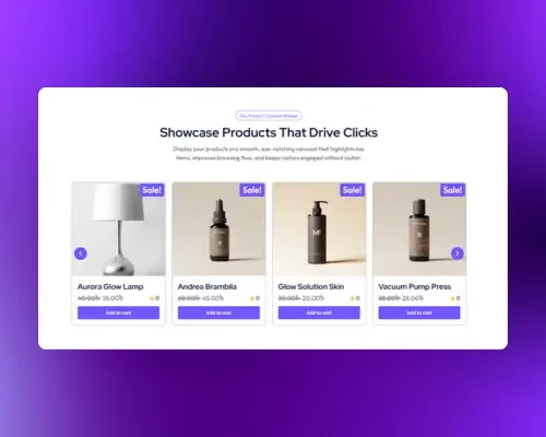
The Card Marquee is an innovative and highly engaging tool designed to create captivating, continuously animated displays of cards on your WordPress website. This versatile Elementor component allows you to showcase a diverse collection of visual content in a compact, interactive, and visually stunning format.
It offers full design flexibility to display content in a variety of styles: with a featured Image, an Icon, or as a full-card Overlay/Background Image. With a wide array of customization options, you can build a perfectly tailored card section that aligns with your website’s branding, whether you need a static grid or a continuously scrolling marquee.
The Card Marquee widget adds a modern, animated scrolling effect to your Elementor layouts, turning static cards into lively, motion-rich displays that keep visitors engaged and help highlight key information on your website.
Common use case for the Card Marquee
A typical use case for the Card Marquee is to create a visually striking and continuously scrolling display of services, features, or product highlights. Businesses frequently use this widget on their homepage or dedicated sections to showcase their offerings in a dynamic and engaging loop. Similarly, content creators and marketers can leverage this unique widget to present a continuous, eye-catching stream of recent blog posts or articles, making their online presence more interactive and memorable. This keeps visitors engaged and allows you to display a large number of content elements without taking up excessive page space.
Additional use cases
- Event or Class Listings: Develop a dynamic and engaging list of upcoming events, conferences, or workshops that continuously scrolls, providing a lively visual recap.
- Team Member Profiles: Efficiently display multiple team member profiles, including their photos, names, and titles, enhancing the “About Us” page experience.
- Product Feature Showcases: Display multiple product features or benefits in a visually appealing, continuously scrolling format.
Requirements
- You need the Marquee Addons and Marquee Addons Pro plugin installed and activated on your website.
- You can find detailed installation instructions in our dedicated installation guideline.
- Make sure that this addon is enabled so you can find it in the Elementor editor.
- Marquee Addons works only with Elementor , so you will need to have it installed and activated as well.
Add the widget
To add the powerful Card Marquee to your Elementor-powered website and start creating dynamic scrolling card displays, follow these simple steps:
- Open your page or post in the Elementor editor.
- In the Elementor sidebar, use the search bar to find the Card Marquee.
- Drag the Card Marquee from the widgets panel and drop it into your desired section or column on your page. This will instantly add a new, engaging scrolling card element to your design.

Video tutorial for Card Marquee
See a video demonstrating the widget in action.
Settings for the Card Marquee
The Card Marquee addon offers extensive customization options categorized into three main tabs: Content, Style, and Advanced.
Content Tab
The Content tab is where you define the content for each card and configure its core layout and scrolling behavior.
Layout: Choose how your cards display in Elementor—Carousel or Marquee—and fine-tune spacing, speed, and direction. For the full walkthrough, read :
Card List:
- Shared Card Options — Image, Video, Icon, Overlay
- Card Style: Choose from Image, Video, Icon or Overlay. This sets the primary display style for all cards in the marquee.
- Cards: Add, duplicate, or delete individual cards.
- Text: Enter the card heading/title.
- Description: Add supporting copy for the card.
- Button: Set the call-to-action button text.
- Link: Add the URL for the button.
- Size: Choose the button size.
- Icon: Pick an icon or upload an SVG.
- Width: Set a specific width for each card. This can be a fixed pixel value and is responsive.
- Image Position: Choose where the media (image/icon/video) appears on the card: Left, Right, Top, or Bottom.
- Text Alignment: Set the alignment for the text content within the card (Left, Center, or Right).
- Title Style: Customize the heading’s visual style.
- HTML Tag: Customize the heading’s HTML tag for SEO best practices (e.g., H1, H2, H3, p, div).
- Background Color: Set the card’s background color for the card.


- Image: Available when Card Style is set to Image.
- Choose Image: Select the image for this card from the Media Library.
- Image Resolution: Pick a registered image size (e.g., Thumbnail, Medium Large, Full). Use the smallest size that looks sharp to optimize performance.

- Video: Available when Card Style is set to Video.
- Choose Video File: Upload/select an MP4/WebM from the Media Library (self-hosted).
- Start Time (sec): Set the timecode where playback begins (e.g.,
3starts at 00:03). - End Time (sec): Set the timecode where playback stops. Leave
0to play to the end. - Autoplay: Start playback automatically. (Most browsers require Mute enabled for autoplay.)
- Mute: Start the video without sound—recommended with Autoplay.
- Loop: Replay the video continuously after it ends.
- Player Controls: Show/Hide native controls (play, scrubber, volume, fullscreen).
- Download Button: Show/Hide a download action on supported browsers.
- Preload: Control initial loading behavior—None (no preload), Metadata (poster/dimensions only), Auto (browser may preload the file). Choose lower preload for better performance.
- Poster: Set a placeholder image shown before playback (and when controls are hidden). Use a lightweight, high-contrast image for best results.
- Choose Image: Select the image for this card from the Media Library.
- Image Resolution: Pick a registered image size (e.g., Thumbnail, Medium Large, Full). Use the smallest size that looks sharp to optimize performance.
- Image Position: Place the image Left, Right, Top, or Bottom relative to the text content.
- Background Color: Set the card’s background color for the Image style (applies behind/around the image and text).

- Icon: Available when Card Style is set to Icon.
- Icon: Choose an icon from the library or upload an SVG to use as the card’s main visual.

- Overlay Image: Available when Card Style is set to Overlay Image.
- Choose Image: Select the background image that the card’s text will overlay.
- Image Resolution: Pick a registered image size (e.g., Medium Large, Full) to balance sharpness and performance for the overlay background.

Text Unfold:
- Enable Text Unfold: Toggle this feature to trim long descriptions.
- Limit By: Choose to limit the description by Words or Characters.
- Show Limit: Enter the number of words or characters to display before the text is folded.
- Fold text & Unfold text: Customize the text for the “Read more” and “Read less” links.

Style Tab
The Style tab allows you to visually customize every aspect of your Card Marquee, ensuring it perfectly matches your website’s design.
Card:
- Padding: Control the inner spacing of the entire card container.
- Border Type: Choose a border style.
- Border Radius: Add rounded corners.
- Box Shadow: Customize the appearance of the card box itself.

Image or video:
Available when Card Style is set to Image or Video.
- Width: Set the width of the image within the card.
- Image Spacing: Adjust the space between the image and the text content.
- Border Type: Choose a border style.
- Border Radius: Add rounded corners.
- Box Shadow: Customize the appearance of the image.

Icon:
Available when Card Style is set to Icon.
- Icon Spacing: Adjust the gap between the icon and the card content/container (responsive).
- Size: Set the icon’s size in pixels for each device.
- Color: Choose the icon color.

Background Image:
Available when Card Style is set to Background Overlay.
- Size: Set how the image fills the card — Cover (fills/crops), Contain (fits without cropping), or Auto (original size).
- Position: Choose the image focal point (e.g., Center Center, Top Left, Bottom Right) to keep key areas visible.
- Repeat: Control tiling — No Repeat, Repeat, Repeat-X, or Repeat-Y.
- Overlay Color: Add a color/gradient on top of the image to boost text contrast (supports Global Colors).
- Overlay Opacity: Adjust the transparency of the overlay; higher values create a stronger tint.

Content:
- Padding: Adjust the inner spacing of the content area.
- Heading: Customize the color, typography, text stroke, and spacing for the heading.
- Description: Customize the color, typography, and spacing for the description.

Text Unfold Style:
- Typography: Customize the font, size, weight, and more for the unfold link.
- Color: Set the color of the “Read more” and “Read less” links.
- Hover Color: Set the color for the links when a user hovers over them

Button:
- Position : Adjust the button position.
- Icon Position: Adjust button’s icon position.
- Icon Spacing: Adjust the button’s icon spacing.
- Button Text Color, Icon Color, Background Color: Customize the button text. Set the colors for the button elements.
- Border Type: Choose a border style.
- Border Radius: Add rounded corners.
- Padding: Control the inner spacing of the button.

Advanced Card Marquee Tab
Advanced Card Marquee Tab provides a comprehensive set of controls that are common to most Elementor widgets, allowing for refined design and responsiveness. Here you can adjust the widget’s Layout (e.g., positioning, Z-index), apply engaging Motion Effects (like scrolling effects or entrance animations), customize its Background, add Borders and Box Shadows, apply Masks for unique shapes, control Responsive visibility across devices, add custom HTML Attributes, and inject Custom CSS for bespoke styling.

Frequently Asked Questions (FAQ)
Q: Can I have a horizontal and vertical scrolling marquee on the same page?
A: Yes, you can use multiple Card List widgets on the same page. Each widget can be configured with its own unique marquee settings, allowing you to have both horizontally and vertically scrolling sections simultaneously.
Q: How do I make the cards responsive for mobile devices?
A: Most settings, such as Width, Spacing, Padding, and Margin, have a responsive device icon next to them. Click on the desktop, tablet, or mobile icon to set specific values for each device, ensuring your layout looks perfect on all screen sizes.
Q: What is the difference between Padding and Margin in the Card settings?
A: Padding adds space inside the card box, pushing the content away from the border. Margin adds space outside the card box, creating a gap between the card and other elements or adjacent cards.
Q: What does the Text Unfold feature do?
A: The Text Unfold feature is designed to keep your card layouts clean and minimal. It automatically trims a long description to a specified number of words or characters and adds a “Read more” link. When a user clicks the link, the full text is revealed without leaving the page.
Q: Can I mix different card styles (Image, Icon, etc.) within a single Card List Widget?
A: No, you select one primary Card Display Style for the entire widget (Image Style, Icon Style, or Overlay Style). However, you have full control over the content and styling of each individual card within that chosen style.

