What is the Animated List?
The Animated List displays a list of items that reveal or cycle with motion. Add an icon, title, and optional description per item, control how many items stay visible, and adjust speed/alignment/looping to draw attention—no code needed.
Common use case
Showcase a short set of features or benefits that animate in sequence to improve scannability and engagement.
Additional use cases
- Process/steps: Present “How it works” with brief, animated steps.
- Updates/changelog: Surface recent changes without taking much space.
- Micro-testimonials/USPs: Rotate quick quotes or key selling points.
Requirements and Installation
To use the Button Marquee, you must meet the following requirements:
- You need the Marquee Addons and Marquee Addons Pro plugin installed and activated on your website.
- You can find detailed installation instructions in our dedicated installation blog post.
- Make sure that this addon is enabled so you can find it in the Elementor editor.
- Marquee Addons works only with the Elementor Page Builder plugin, so you will need to have it installed and activated as well.
Add the widget
To add the Button Marquee to your Elementor-powered website, follow these simple steps:
- Navigate to the Elementor editor for the page you want to edit.
- In the widgets panel, search for the Animated List.
- Drag the widget to your desired location on the page.

Settings for the Animated List
The customization options for the Animated List are divided into three main tabs: Content, Style, and Advanced.
Content Tab
The Content tab is where you define how many items are visible, add/edit list items (icon, title, description), set alignment, and control animation speed and looping.
Content: Configure which list items appear and how they animate.
- Visible Items: Number of items shown at once. Set 0 to show all items (no limit).
- List: Add/duplicate/reorder/remove list items with Add Item.
- Alignment: Align the list Left / Center / Right (responsive).
- Animation Speed: Control how fast items transition (higher = faster).
- Loop: Repeat the animation continuously.

List Item
Customize each animated list entry.
- Icon: Choose an icon for the item.
- Title: Enter the item title.
- Description: Optional supporting text; leave empty to hide automatically.

Style Tab
The Style tab controls the look of the Animated List—set list width and gaps, backgrounds and borders, then style each item’s title, description, and icon (colors, typography, shadows, spacing).
List: Style the container and spacing for list items.
- Width: Set the list container width (responsive).
- Gap: Space between list items.
- Background Type: Choose Classic or Gradient for the card background.
- Classic (Color): Set a color.
- Gradient: Set gradient colors, type, and angle.
- Border Type: Choose Default, None, Solid, Double, Dotted, Dashed, or Groove.
- Border Width: Set border thickness (per side).
- Border Color: Pick the border color.
- Box Shadow: Shadow for the list items per state.
- Border Radius: Round the list item corners.
- Padding: Inner spacing for each item.

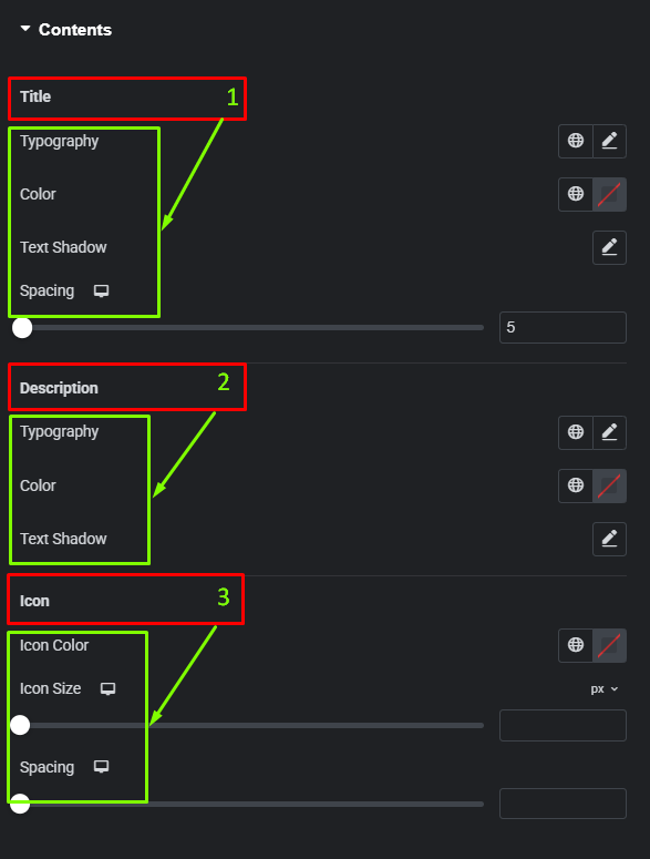
Contents: Style the text and icon inside each list item.
- Title:
- Typography — Font family, size, weight, line-height, letter spacing.
- Color — Title color.
- Text Shadow — Add shadow for emphasis.
- Spacing — Gap below the title.
- Description:
- Typography — Body text controls.
- Color — Description color.
- Text Shadow — Optional shadow for readability.
- Icon:
- Icon Color — Set the icon color.
- Icon Size — Define the icon size.
- Spacing — Space between icon and text.
Frequently Asked Questions
How do I show more than one item at a time?
Use Content → Visible Items and enter the number of items you want displayed simultaneously. Set it to 0 to remove the limit and show the entire list at once. This is useful for feature grids or longer checklists.
The description isn’t showing—why?
Descriptions are optional. If you leave the Description field empty for an item, the widget hides that line automatically to keep the layout clean. Add text in List Item → Description to display it, then style it under Style → Contents → Description.
Can I loop the animation continuously?
Yes. Enable Loop in Content. When Loop is on, items cycle indefinitely. Pair it with Animation Speed to balance readability (slower) and attention (faster).