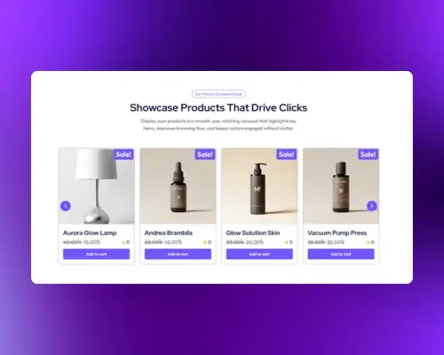
What is the Product Carousel?
The Product Carousel is a WooCommerce-focused widget that displays products in a horizontal, slide-based layout. Instead of showing products in a static grid, it allows users to browse items smoothly using navigation arrows or automatic sliding. This layout helps showcase more products in less space while keeping the browsing experience interactive and user-friendly.
Common use case
A common use case is to place the Product Carousel widget on your homepage or landing pages to feature a selection of your top-selling products. By setting the marquee to scroll continuously, you can create a high-impact, engaging section that immediately grabs visitors’ attention and directs them towards your most popular items.
Additional use cases
- Showcasing new arrivals: Create a dedicated “New Arrivals” section on your website to display the latest products as they are added to your store.
- Highlighting a seasonal sale: Use the marquee to draw attention to products included in a limited-time sale or seasonal promotion.
- Displaying customer favorites: Feature a curated list of products that have received high ratings or positive reviews, building social proof and encouraging conversions.
Requirements
- Have the WooCommerce plugin installed and activated.
- Make sure you have products added to your WooCommerce store.
- You need the Marquee Addons and Marquee Addons Pro plugin installed and activated on your website.
- You can find detailed installation instructions in our dedicated installation blog post.
- Make sure that this addon is enabled so you can find it in the Elementor editor.
- Marquee Addons works only with the Elementor Page Builder plugin, so you will need to have it installed and activated as well.
Add the widget
To add the Product Carousel to your page:
- Navigate to the page where you want to add the widget.
- In the Elementor editor, search for “Product Carousel” in the widget panel.
- Drag and drop the widget onto your page.
- The widget will automatically populate with a scrolling display of your products.

Video tutorial for Product Carousel
See a video demonstrating the widget in action.
Settings for the Product Carousel
Content tab
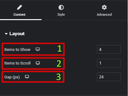
Layout
- Items to Show: Set how many product cards are visible at once in the carousel.
- Items to Scroll: Define how many products move per slide transition.
- Gap (px): Adjust the spacing between individual product cards.
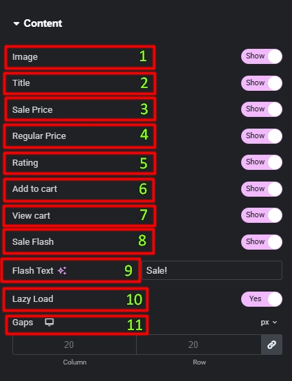
Content
- Image: Toggle to display or hide the product image.
- Title: Toggle to display or hide the product title.
- Sale Price: Toggle to display or hide the product sale price.
- Regular Price: Toggle to display or hide the product regular price.
- Rating: Toggle to display or hide the product ratings.
- Add to cart: Toggle to display or hide the “Add to Cart” buttons.
- View Cart: Toggle to display or hide the “View Cart” buttons.
- Sale Flash: Toggle to display or hide the “Sale!” badge on discounted products.
- Flash Text: Customize the text for the sale badge.
- Lazy Load: Enable this to load images only when they enter the viewport, improving page performance.
- Gaps: Adjust spacing between product elements using Column and Row gaps.
Query
- Source: Select the product source to display, such as “Latest Products,” “Products,” “Sale Products,” or “Featured Products.”
- Limit: Set the number of products to display. Enter “-1” to show all products.
- Include By/Exclude By: Choose the taxonomy to include or exclude, such as “Terms,” or “Authors.”
- Terms: Select specific terms from available taxonomies, such as Categories, Tags, Formats, and custom taxonomies.
- Authors: Select specific authors to include.
- Order By: Choose the order of products, such as “Date,” “Title,” or “Price.”
- Order: Set the order to ascending (ASC) or descending (DESC).

Carousel Options
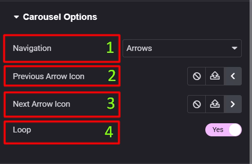
- Navigation: Choose how users move between items — Arrows, Dots, or disable navigation entirely.
- Previous Arrow Icon: Select or customize the icon used to navigate to the previous slide.
- Next Arrow Icon: Select or customize the icon used to navigate to the next slide.
- Loop: Enable continuous looping so the carousel starts again after the last item (or disable to stop at the ends).
Style tab
Card
- Width: Set the width of each product card.
- Background Type: Choose a background color or gradient for the cards.
- Padding: Adjust the padding inside the product card.
- Border Type: Add a border to the cards.
- Border Radius: Add rounded corners to the cards.
- Box Shadow: Apply a box shadow effect to the cards for depth.

Image
- Padding: Adjust the padding inside the image box.
- Border Type: Add a border to the product images.
- Border Radius: Add rounded corners to the images.
- CSS Filters: Apply visual effects like blur, brightness, or saturation to the images.
- Box Shadow: Apply a box shadow effect to image for depth.

Content
- Padding: Adjust the padding inside the testimonial box.
- Title:
- Text Alignment: Set the alignment for the title.
- Color: Set the text color.
- Typography: Customize the typography for the title.
- Spacing: Set the spacing below the title.
- Price & Rating:
- Alignment: Set the horizontal alignment for the price and rating.
- Price:
- Color: Set the text color.
- Typography: Customize the typography for the price.
- Regular Price:
- Color: Set the text color.
- Typography: Customize the typography for the regular price.
- Rating:
- Color: Set the text color for the rating.
- Typography: Customize the typography for the rating.
- Icon Color: Set the color of the star icons.
- Icon Size: Adjust the size of the star icons.

Buttons
- Typography: Customize the typography of the button.
- Normal/Hover: Style the buttons for both their normal and hover states.
- Text Color: Set the color of the button text.
- Background Color: Set the background color of the button.
- Alignment: Align the buttons within the card.
- Border Type: Add a border to the buttons.
- Border Width: Set the width of the button border.
- Border Color: Set the color of the button border.
- Border Radius: Add rounded corners to the buttons.
- Padding: Adjust the padding inside the buttons.
- Spacing: Adjust the spacing between the buttons.
- View Cart:
- Typography: Customize the typography of the “View Cart” button.
- Normal/Hover: Style the “View Cart” button for its normal and hover states.
- Text Color: Set the color of the “View Cart” button text.
- Background Color: Set the background color of the “View Cart” button.
- Border Type: Add a border to the buttons.
- Border Radius: Add rounded corners to the buttons.
- Spacing: Adjust the spacing of the “View Cart” button.

Sale Flash
- Text Color: Set the color of the “Sale!” text.
- Background Color: Set the background color of the sale badge.
- Typography: Customize the typography of the sale badge.
- Padding: Adjust the padding around the sale badge.
- Border Type: Add a border to the sale badge.
- Border Radius: Adjust the corner radius of the sale badge.
- Box Shadow: Apply a box shadow effect to the sale badge for depth.
- Position: Adjust the horizontal position of the sale badge.
- Vertical Distance: Fine-tune the vertical position of the sale badge.
- Horizontal Distance: Fine-tune the horizontal position of the sale badge.

Arrow Button
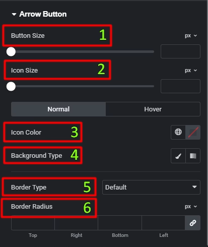
- Button Size: Set the overall width and height of the arrow button container.
- Icon Size: Control the size of the arrow icon inside the button.
- Icon Color (Normal / Hover): Set the arrow icon color for normal and hover states.
- Background Type: Choose Classic or Gradient background for the arrow button in normal and hover states.
- Border Type: Select the border style for the arrow button (Default, None, Solid, Double, Dotted, Dashed, Groove).
- Border Radius: Adjust the corner roundness of the arrow button (use higher values for circular buttons).
Advanced tab
The Advanced tab provides a comprehensive set of controls that are common to most Elementor widgets. Here you can adjust the widget’s Layout (e.g., positioning, Z-index), apply engaging Motion Effects (like scrolling effects or entrance animations), customize its Background, add Borders and Box Shadows, apply Masks for unique shapes, control Responsive visibility across devices, add custom HTML Attributes, and inject Custom CSS for bespoke styling. This widget also includes a specific Marquee Custom CSS section, allowing for even more granular control over its unique animation properties.

Frequently Asked Questions (FAQ)
Can I control how many products are visible at once?
Yes. Use Items to Show in the Layout settings to define how many product cards appear in the carousel at the same time.
Can I control how many products move per slide?
Yes. The Items to Scroll option lets you choose how many products advance when the carousel moves.
Can I change or disable navigation arrows?
Yes. You can choose the navigation type (Arrows, Dots, or None) and customize or hide the Previous and Next arrow icons.
Is the Product Carousel responsive?
Yes. All layout, spacing, and styling controls support responsive settings for desktop, tablet, and mobile.

