What is the Background Box effect?
The Background Box effect is an interactive background option available in the MA Background extension of Marquee Addons Pro. It displays a structured grid pattern that reacts to mouse movement, creating a dynamic and responsive background experience. This effect is ideal for modern, tech-focused designs where subtle interaction enhances visual depth without overwhelming the content.
Common use case
A common use case for the Background Box effect is on tech or SaaS landing pages, where the interactive grid adds a “developer” or “blueprint” aesthetic. The mouse-responsive behavior helps sections feel alive while keeping the layout clean and professional.
Additional use cases
- Interactive portfolios: Add subtle motion to project or case-study sections.
- Feature sections: Reinforce technical or data-driven content visually.
- Pricing tables: Add modern background depth without distractions.
- Hero sections: Create engagement through interaction rather than animation loops.
Requirements
To use the Background Box, you need to have the following:
- You need the Marquee Addons Pro plugin installed and activated on your website.
- You can find detailed installation instructions in our installation guide.
- Make sure that this addon is enabled so you can find it in the Elementor editor.
- Marquee Addons works only with the Elementor Page Builder plugin, so you will need to have it installed and activated as well.
Add the extension
The Background Box isn’t a standalone widget; it is an enhancement found within the settings of any Container.
- Open your Elementor editor and select an existing Container or drag a new one onto the canvas.
- Go to the Style Tab in the panel.
- Locate the section labeled MA Background.
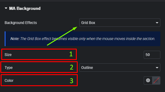
- Toggle the Background Effects dropdown to choose Grid Box.
Video Tutorial for Background Box effect
See a video demonstrating the effect in action.
Settings for the Background Box effect
All Grid Box Background controls are located in the Style tab of the selected Container.
- Size: Define the dimensions of the grid squares.
- Type: Choose between Outline (stroke) or Filled boxes.
- Color: Set the color of the grid lines/boxes.
- Note: This effect is interactive and becomes visible when the mouse moves inside the section.


